Recruit B2B SaaS Partners with Landing Pages and Three Emails
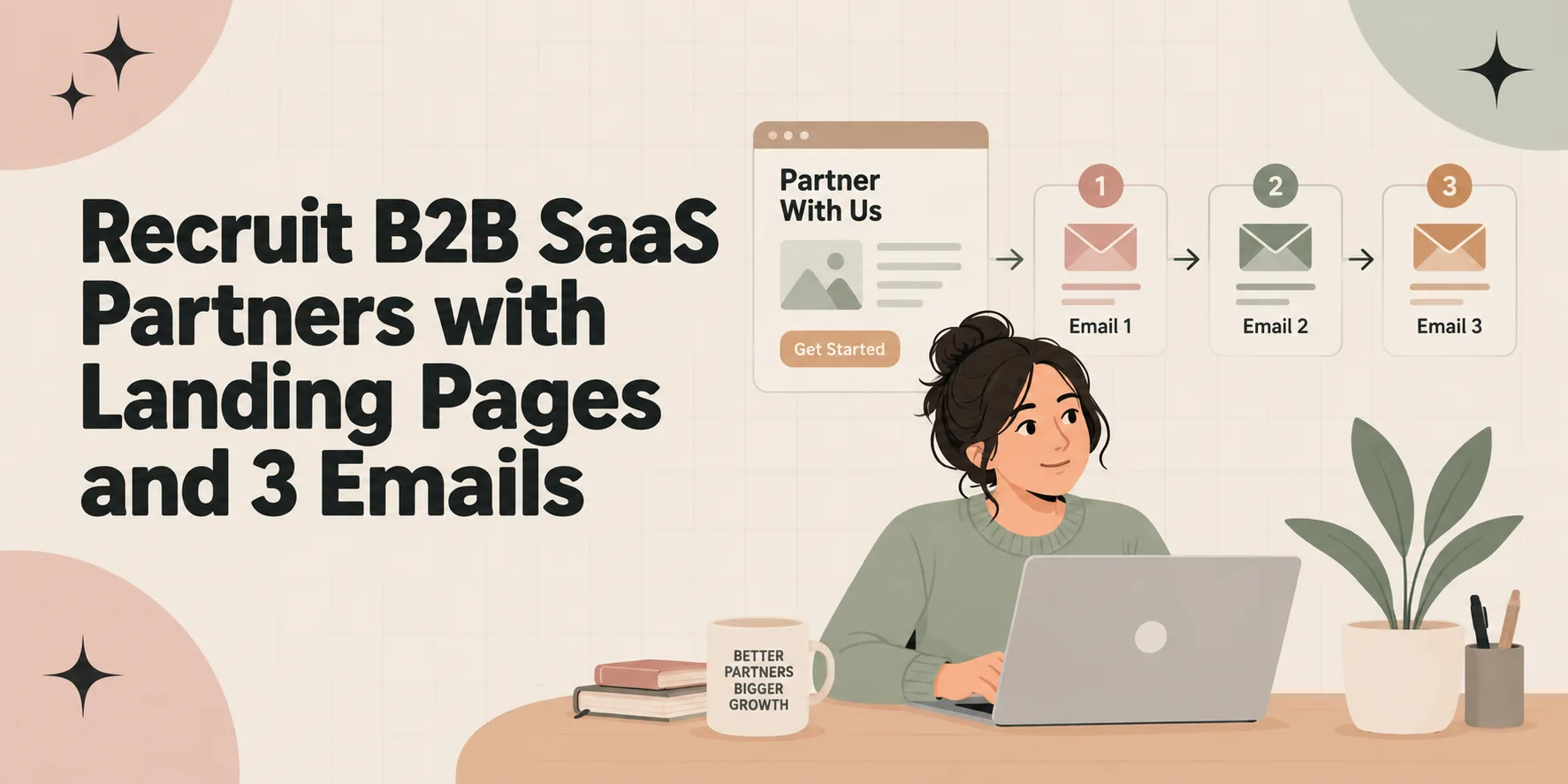
An affiliate landing page is a single-purpose page built to turn affiliate traffic into a tracked click, a lead, or a partner application. If you’re sending cold traffic, you almost always need one. If you’re a program manager recruiting partners, your program page does the same job, aimed at signups instead of sales.
TL;DR:
- Cold traffic from paid ads or outbound links requires a pre-sell or bridge page to build trust before directing visitors to the offer.
- A co-branded landing page that incorporates an affiliate’s branding can significantly increase conversion rates, especially when extended through checkout.
- An effective affiliate landing page must feature a benefit-focused headline, a clear call to action, structured AIDA copy, and a mobile-friendly, fast-loading design.
- For program recruitment, a dedicated landing page should clearly state commission details, resources, target partner profile, and include an easy application process.
- Activating partners promptly after sign-up with a short onboarding sequence is crucial, as ongoing engagement drives better performance than just the landing page itself.
Table of Contents
- Do You Actually Need a Landing Page?
- What’s the Difference Between a Landing Page, a Bridge Page, and a Program Page?
- What Does a High-Converting Affiliate Landing Page Need?
- How Do You Build an Affiliate Program Landing Page That Recruits Real Partners?
- Do Co-Branded Landing Pages Really Convert Better?
- How Do You Build a Landing Page Without a Development Team?
- How Do You Track Affiliate Links and Stay Disclosure-Compliant?
- What Do High-Converting Landing Page Templates Actually Look Like?
- What Mistakes Actually Kill Affiliate Program Performance?
- Are Landing Pages the Real Bottleneck in B2B SaaS Affiliate Growth?
- What Products Help You Fix This Faster?
- Sources
Do You Actually Need a Landing Page?
Not every affiliate link needs a landing page in between. The decision comes down to where the traffic starts and what you’re asking someone to do next.
Warm traffic, someone already reading a trusted newsletter or watching a product review, often converts fine clicking straight through to the offer page. Cold traffic doesn’t. A visitor arriving from a paid social ad or a cold outbound link has zero context and zero trust in the destination. Drop them straight onto a product page built for warm buyers, and you lose most of them before they scroll.
So: match the page to the temperature of the click, not just the goal.
- Cold social or paid traffic needs a pre-sell or bridge page that builds context before the pitch.
- Warm audience traffic (email lists, loyal subscribers) can often skip the lander and go direct.
- Lead-generation goals need a dedicated capture page, regardless of traffic temperature.
- Partner recruitment always needs its own landing page, since applicants are evaluating you, not a product.
Skip the lander and you’re relying on the destination page to sell the offer and build trust at once, which most product pages aren’t written to do. But if you have a highly engaged following and the extra click would only slow the buyer down, don’t add a step for the sake of having one. Landing pages close a trust gap. No gap, no page.
What’s the Difference Between a Landing Page, a Bridge Page, and a Program Page?
These terms get used interchangeably, and that sloppiness leads to the wrong page getting built for the wrong job. Each type has a distinct purpose, audience, and success metric.
- Landing page: a general term for any single-purpose page designed around one conversion goal, whether that’s a sale, a signup, or an application.
- Bridge page (pre-sell page): a page inserted between an ad or cold link and the final offer, meant to warm up skeptical traffic before asking for a purchase or opt-in.
- Affiliate program landing page: a recruitment page aimed at prospective partners, built to sell the program itself, not a product.
- Co-branded landing page: a version of any of the above that carries a specific affiliate’s or creator’s branding alongside the advertiser’s, used to preserve trust that traffic already has in that individual.
Cold ad traffic pairs with a bridge page. Someone searching “how does X compare” pairs with a direct landing page. A creator’s audience pairs with a co-branded page. Anyone weighing up whether to join your program gets a dedicated program page, never a “partner with us” paragraph buried in a footer link.
If you’re stuck: ask what does the visitor believes when they land, and what do they need to believe when they leave? If those two states are far apart, you need a bridge page. If the visitor already trusts the source, a direct landing page or program page will do.
What Does a High-Converting Affiliate Landing Page Need?
Strip away the design flourishes and every page that converts has the same parts: a headline, a call to action, proof, and a fast mobile layout with one job.
1. Headline and subheadline that state the benefit, not the feature. Your headline should answer “what do I get” in under ten words. The subheadline handles the “how” or “for whom.” Test variations that lead with an outcome (“Cut onboarding time in half”) against ones that lead with a mechanism (“AI-powered onboarding software”). Outcome-led headlines tend to win with cold traffic because they don’t require product knowledge to land.
2. A single, unmistakable call to action. The CTA wording should shift depending on what you’re asking for. “Start Free Trial” works for a click-through page. “Get My Free Checklist” works for lead-gen. “Apply to Partner Program” works for recruitment. Never use the same generic “Learn More” across all three; it undersells the specific action and confuses the reader about what happens next.
3. Copy structured around AIDA. Attention, Interest, Desire, Action remains the simplest reliable framework for affiliate landing page copywriting. Open with the hook (attention), follow with the problem and why it matters (interest), stack three or four benefit-first bullets that paint the after-state (desire), then close with the CTA (action). Keep every bullet benefit-first: “Save four hours a week on manual reporting,” not “Includes automated reporting module.”
4. Trust signals placed near the decision point, not buried at the bottom. A testimonial, a client logo bar, or a specific stat belongs directly above or beside your CTA button, where the reader is actually deciding. Star ratings work well for consumer offers. Named case-study results work better for B2B software buyers who want proof tied to a real outcome.
5. Mobile-first layout with minimal navigation. Strip your top nav down to nothing, or close to it. The best landing page examples keep the primary CTA above the fold and cut anything that gives a visitor a reason to leave the page before converting, including menu links back to your homepage.
6. Fast load times. Compress hero images, avoid autoplay video, and test on a throttled connection. A three-second delay on mobile kills conversion rate faster than weak copy ever will.
Here’s how those elements stack up depending on which type of page you’re building:
| Page type | Primary CTA | Section order |
|---|---|---|
| Pre-sell / bridge | “Read the full story” or “See the offer” | Hook, problem, story, proof, soft CTA |
| Lead-gen | “Get the free [asset]” | Headline, benefit bullets, form, trust signal |
| Click-through | “Start free trial” / “Shop now” | Headline, product proof, comparison, CTA |
Pro Tip: Run your headline through a five-second test: show it to someone unfamiliar with your offer for five seconds, then ask them what you’re selling. If they can’t answer, the headline isn’t doing its job.
How Do You Build an Affiliate Program Landing Page That Recruits Real Partners?
Your program landing page needs to function like a sales page, except the product being sold is the partnership itself, and the buyer is evaluating whether the program is worth their time and audience.
The single biggest mistake I see program managers make is treating this page as an afterthought, a plain paragraph on a footer link that says “Join Our Affiliate Program” with no specifics. Serious affiliates skip vague pages entirely, because vague pages usually mean disorganized programs.
Structure it around five things:
- A headline with your commission summary and one differentiator up top: “Earn 30% Recurring Commission, Paid Monthly” tells a prospective partner exactly what’s in it for them before they scroll another inch.
- A complete commission and cookie-window breakdown: rate structure (flat versus recurring), payment cadence, minimum payout threshold, and cookie duration stated in plain numbers, not “competitive rates.”
- Resources and support: a creative asset library, onboarding materials, a dashboard for reporting, and whether co-branded landing pages are available to top partners.
- An ideal partner description: name the audience size, niche, or content type you want. This single addition does more to filter out low-quality applicants than any application form field ever will, since program pages that state commission, cookie window, and resources upfront consistently attract higher-quality partners than pages that stay vague.
- A frictionless CTA with a clear next step: “Apply Now” should lead to a short form, not a ten-field survey, and the confirmation should state exactly what happens next and when.
Program managers running B2B SaaS affiliate relationships also benefit from pairing this page with a clear partner hub structure that houses the resources you promised on the landing page. A recruitment page that oversells support and then delivers a broken resource link erodes trust before the relationship even starts.
Do Co-Branded Landing Pages Really Convert Better?
Yes, and the gap isn’t small. Co-branded landing pages that preserve a creator’s or affiliate’s identity typically raise conversion rates because the visitor never loses the sense that they’re still with someone they trust.
Case studies compiled by CreatorCommerce report conversion lifts ranging from moderate to very high, depending on how far the co-branding extends into the shopping journey. The pages that carry a creator’s face, colors, or voice only on the entry landing page see solid lifts. The ones that extend that identity through the product page and checkout see the largest jumps.
That distinction matters for how you implement this. You have two real options:
- A single co-branded landing page: your affiliate’s name, photo, or logo sits at the top of an otherwise standard page. Fast to produce, works well for mid-tier partners.
- A co-branded storefront: the affiliate’s branding persists through product selection and checkout, not just the entry page. Tapfiliate’s data shows this deeper approach lifts both conversion rate and average order value compared to a single co-branded entry page.
The catch is scale. You can’t hand-build a fully co-branded storefront for every affiliate in your program. Reserve that investment for your top 5 to 10 partners by revenue, and use a lighter, templated co-branded landing page for everyone else. Attribution still needs to run through your normal tracking links regardless of which version you use; co-branding is a design layer, not a tracking method.
How Do You Build a Landing Page Without a Development Team?
You don’t need custom code to launch a solid affiliate landing page. The right tool depends on how much control you need versus how fast you need to ship.
1. Start with a hosted landing page builder if speed matters more than design flexibility. These platforms come with pre-built templates that already follow the mobile-first, single-CTA structure that converts.
2. Use WordPress with a dedicated page-builder plugin if you’re already on WordPress and want more design control without hiring a developer. This route takes longer to set up but gives you ownership of the page long-term instead of renting a builder subscription.
3. Build from a custom template only if you have design or development resources in-house and need something highly specific, like a co-branded storefront that persists through checkout.
Whichever route you pick, your template needs four things baked in before launch: your tracking snippet, your affiliate disclosure, a clearly placed CTA, and a mobile-render check on at least two screen sizes.
4. Run this QA checklist before you send traffic:
- Click your own affiliate link from a fresh browser and confirm the cookie fires.
- Check your tracking pixel loads in your browser’s network tab.
- Test load time on a throttled mobile connection, aiming under three seconds.
- Preview the page on an actual phone, not just a resized browser window.
5. Prioritize your first test correctly. Headline testing consistently ranks among the highest-leverage changes you can make, since a headline swap touches every visitor before they read anything else. Test one headline variable at a time (benefit versus mechanism, question versus statement) and let each test run long enough to hit a meaningful sample before calling a winner.
Pro Tip: Before you scale traffic to a new page, send yourself the affiliate link and walk through the entire path exactly as a stranger would. Broken tracking is invisible until you check it from the customer’s seat.
How Do You Track Affiliate Links and Stay Disclosure-Compliant?
Attribution breaks more affiliate relationships than bad copy does. If a partner drives ten sales and only gets credit for six, you won’t hear complaints, they’ll simply stop promoting you.
Protect attribution with a few habits: use direct affiliate links wherever possible instead of stacking multiple redirects, since proper affiliate tracking links are one of the core requirements of a high-converting affiliate page. Every redirect hop is a place a cookie can drop or a UTM parameter can get stripped.
- Use UTM parameters alongside your affiliate platform’s native tracking so you can cross-check numbers in Google Analytics against your affiliate dashboard.
- Decide upfront whether you’re relying on browser cookies or server-side tracking; server-side tracking survives ad blockers and Safari’s cookie restrictions far better.
- Set a recurring monthly check where you personally click five random affiliate links and confirm they attribute correctly.
- Verify your cookie window matches what’s stated publicly on your program page. A mismatch here is a fast way to lose partner trust.
Disclosure isn’t optional, and it isn’t a footer afterthought either. Place your affiliate disclosure near the top of the page, before the CTA if the page is short, or immediately following the headline block on longer pages. It should be plain language, not legal jargon: “This page contains affiliate links. We may earn a commission if you purchase through them, at no extra cost to you.” Vague or hidden disclosures don’t just risk noncompliance; they erode the exact trust your co-branded and bridge pages are working to build.
What Do High-Converting Landing Page Templates Actually Look Like?
You don’t need to reinvent page structure. Three formats cover almost every affiliate use case, and each one has a predictable block order.
- Pre-lander (story-led): Hook headline, personal story or problem setup, three proof points, single soft CTA (“See what worked for me”). Track click-through rate and time on page.
- Lead-gen lander: Benefit headline, three-bullet value stack, short form (name and email only), one-line privacy note. Sample microcopy: “Get the free audit template, no spam, unsubscribe anytime.” Track opt-in rate.
- Co-branded lander: Affiliate name and photo near the top, standard benefit stack, a personalized note or quote block, standard CTA. Track conversion rate against a non-co-branded control.
Browsing a gallery of landing page examples is worth an hour before you build, not to copy designs outright, but to spot which hero and CTA patterns keep recurring across unrelated industries. That repetition is a signal, not a coincidence.
What Mistakes Actually Kill Affiliate Program Performance?
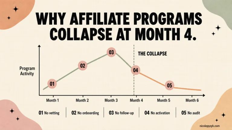
Most underperforming affiliate programs don’t fail because of a bad landing page. They fail because nobody activates the affiliates after they sign up.
The mistake I see most often: a program manager builds a solid recruitment page, gets applications, approves partners, and then goes silent. No onboarding, no first-week check-in, nothing. The affiliate signed up with intent and then had nowhere to direct that energy.
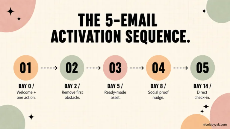
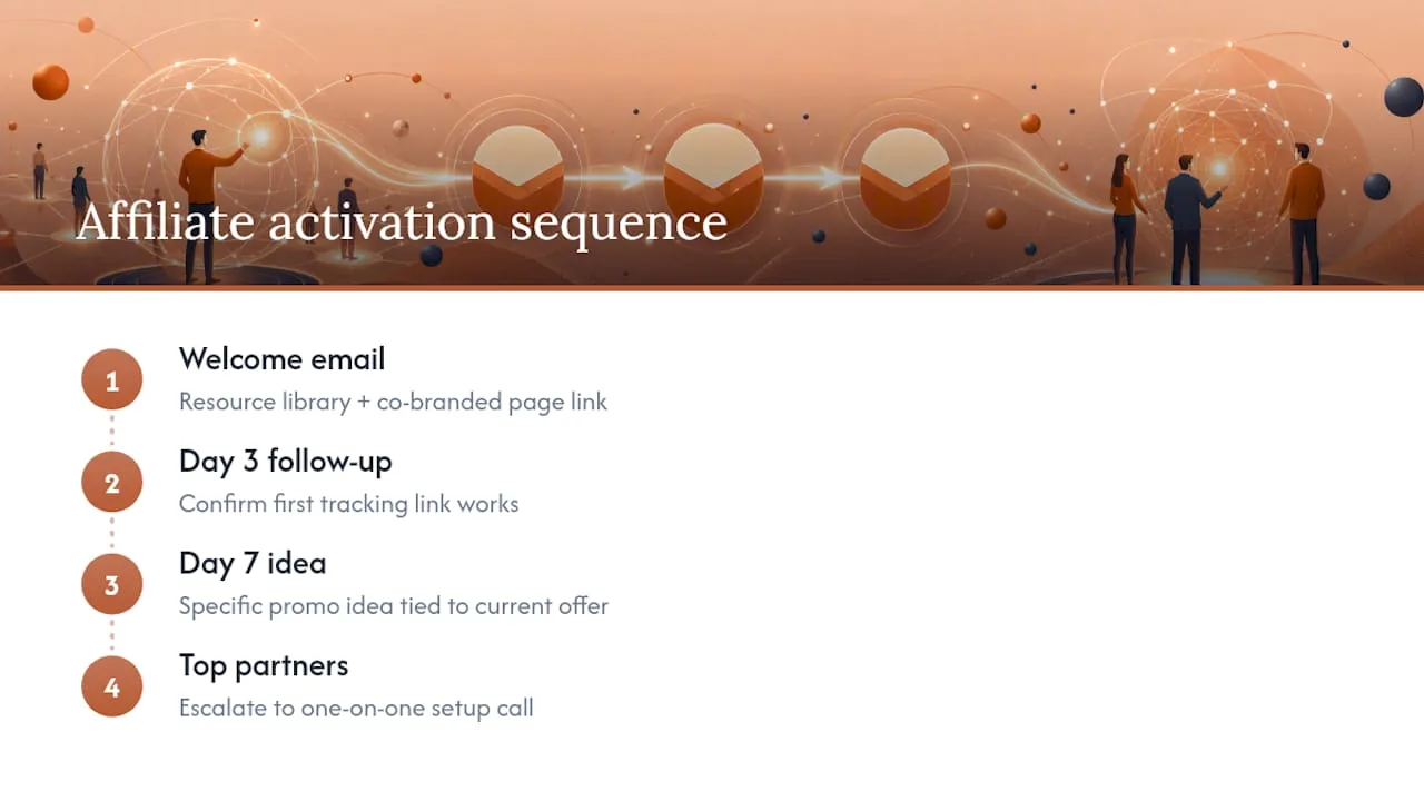
Fix it with a short activation sequence, not a long drip campaign. Three emails is usually enough: one welcome message with the resource library and a co-branded page link if you offer one, one follow-up at day three confirming their first tracking link actually works, and one at day seven with a specific promotional idea tied to a current offer. For your top partners, escalate to a quick one-on-one setup call instead of relying on email alone.
Pro Tip: The welcome sequence is not the relationship. It’s the handshake. Judge success by whether the affiliate takes a real action in the first week, not by your open rates.
Are Landing Pages the Real Bottleneck in B2B SaaS Affiliate Growth?
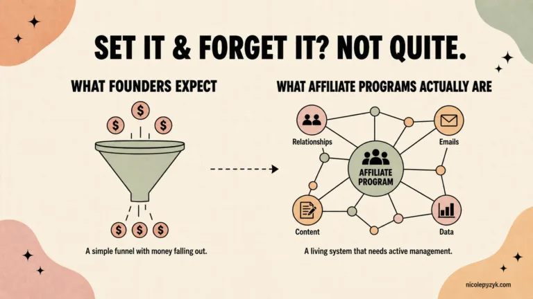
Here’s what I think most B2B SaaS teams get backwards: they treat the landing page as the finish line, when it’s really just the first checkpoint in a longer partner relationship.
A well-built page will lift your conversion rate. It will not fix a program that recruits partners and then leaves them to figure things out alone. I’ve watched programs with mediocre landing pages outperform programs with beautifully designed ones, simply because the mediocre program followed up and the pretty one didn’t.
If you’re a solo affiliate marketer, you can iterate on your own page with the templates above and a basic A/B test. If you’re managing a B2B SaaS program with dozens or hundreds of partners, the leverage point shifts from page design to systems: activation sequences, resource libraries, and a landing page architecture that scales without you rebuilding it for every new partner tier.
Before you touch your page copy again, run an honest audit of your program to see whether the bottleneck is really the page, or everything around it.
— Nicole
What Products Help You Fix This Faster?
If your program page is solid but your partners go quiet after signing up, that’s an activation problem, not a design problem, and it’s the one most affiliate program managers overlook.
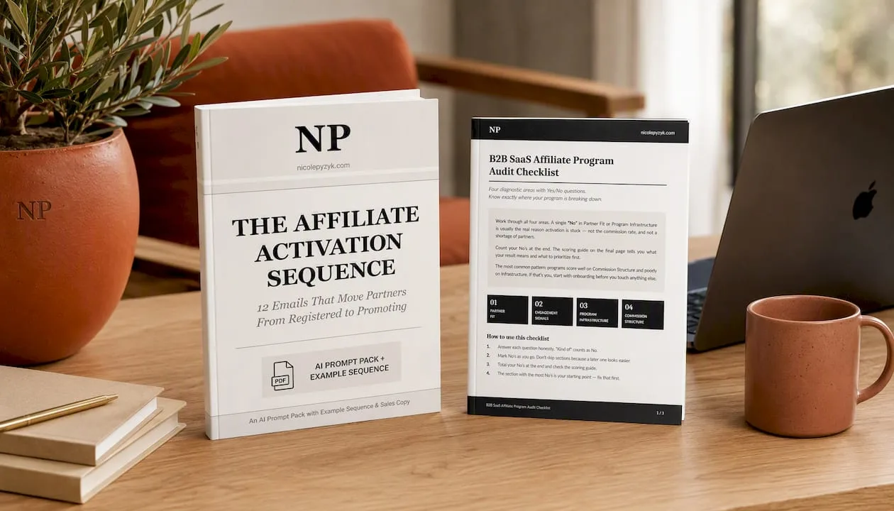
The Affiliate Activation Sequence is a downloadable email template set built around the exact three-email structure described above: a welcome message, a day-three tracking check, and a day-seven promotional nudge. It’s built specifically to plug into a B2B SaaS program where partners sign up, get a landing page and resources, and then need a nudge to actually start promoting. You can review it on the Activation Sequence product page.
If you’re not sure whether your landing page, tracking setup, or partner resources are the actual weak point, start with the B2B SaaS Affiliate Program Audit Checklist. It walks through program fit, page structure, commission clarity, and tracking integrity so you know exactly what to fix first instead of guessing.
Sources
Claims on layout and mobile-first design draw from Figma’s landing page resource library. AIDA structure and disclosure guidance come from ClickBank’s affiliate landing page guide. Program-page requirements are sourced from Impact’s recruitment guide, and co-branding conversion data comes from CreatorCommerce.
- Landing Page for Affiliate Marketing: The Ultimate Guide for Affiliates (ClickBank)
- How to build an affiliate program landing page that recruits better partners (Impact)
- What Is a Co-Branded Landing Page | CreatorCommerce